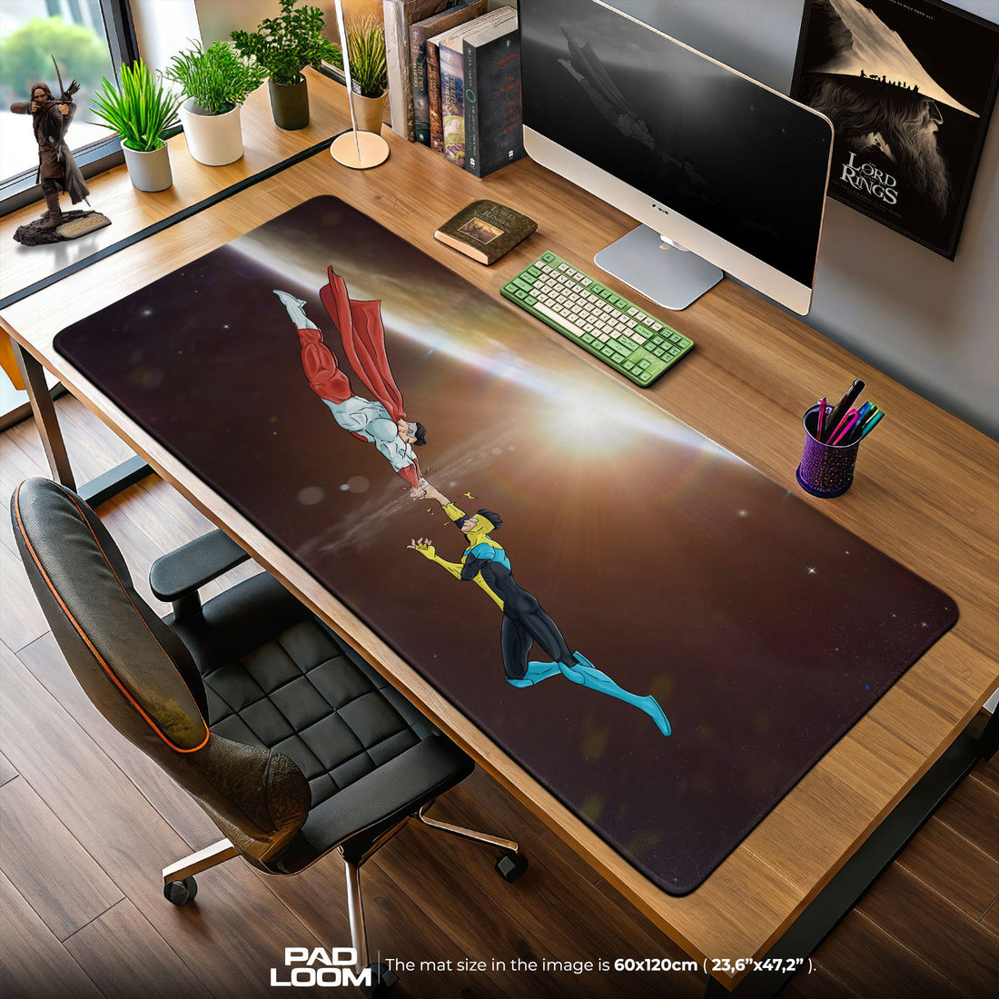
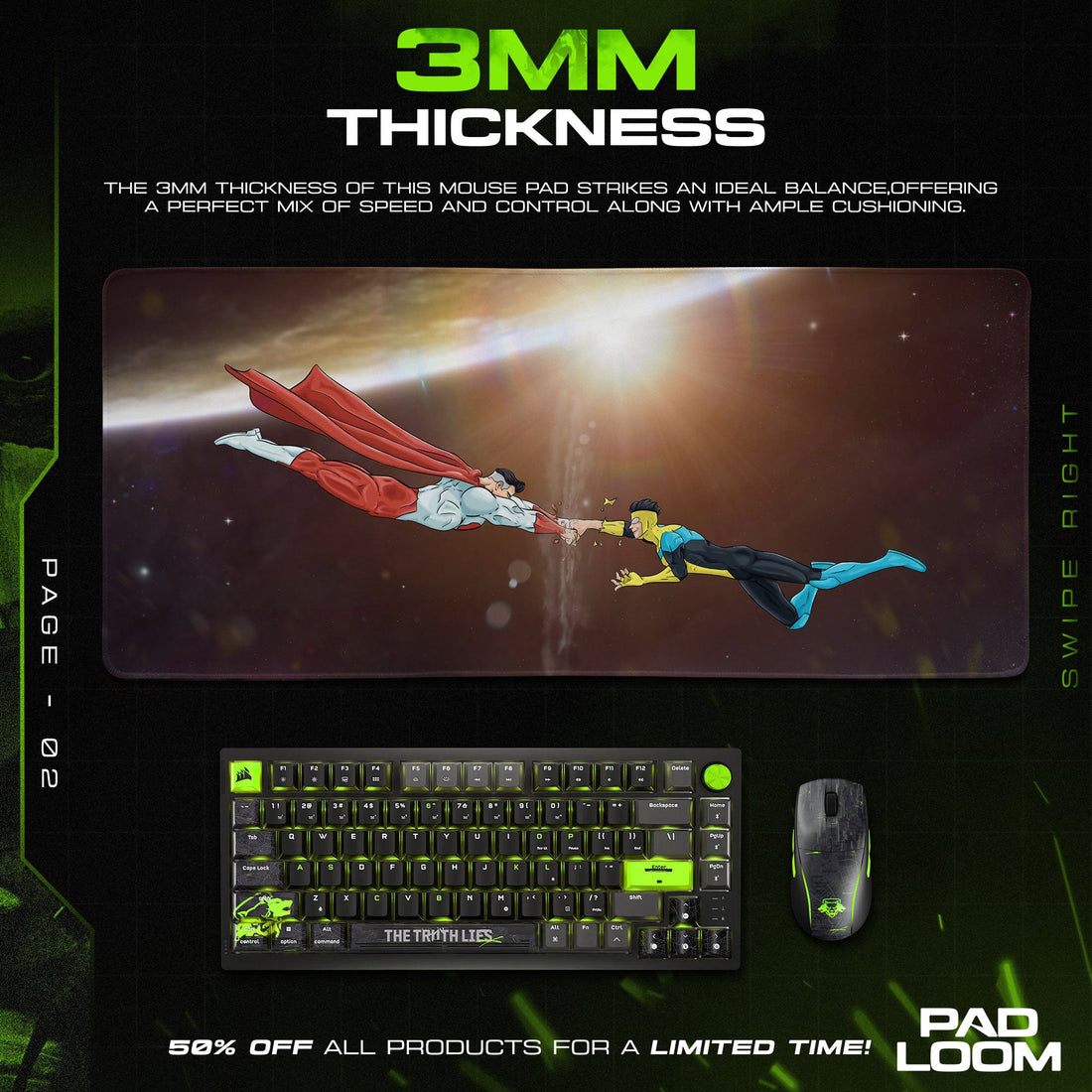
Invincible Mouse Pads

- Featured
- Best selling
- Alphabetically, A-Z
- Alphabetically, Z-A
- Price, low to high
- Price, high to low
- Date, old to new
- Date, new to old
Recently Viewed Products
⬇ Scroll down to read full collection description ⬇
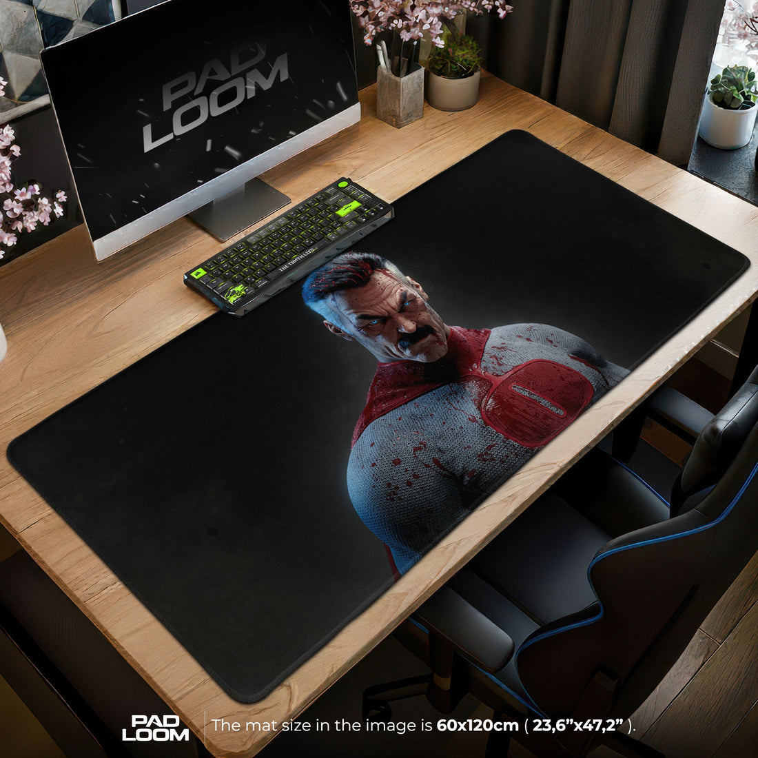
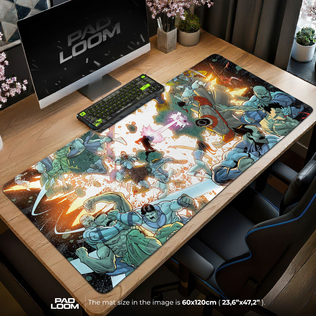
The visceral crack of bone against alien exoskeleton reverberates through space as blood droplets float in zero gravity, while on Earth, a teenager in a yellow and blue costume discovers that becoming a superhero means confronting truths more devastating than any physical blow – this brutal coming-of-age story now translates into Invincible Mouse Pads that bring Robert Kirkman's groundbreaking narrative to workspaces ready for something beyond typical superhero fare. From the deceptively simple animation style that lulls viewers into comfort before unleashing shocking violence to the complex emotional landscapes where family betrayal cuts deeper than any villain's attack, these designs capture a series that redefined what animated superhero content could achieve. The distinctive aesthetic of Cory Walker and Ryan Ottley's original comic art, brilliantly adapted by Amazon Prime's animation team, creates surfaces that announce your appreciation for storytelling that refuses to pull punches, where consequences matter and heroes bleed real blood that doesn't conveniently disappear between episodes.
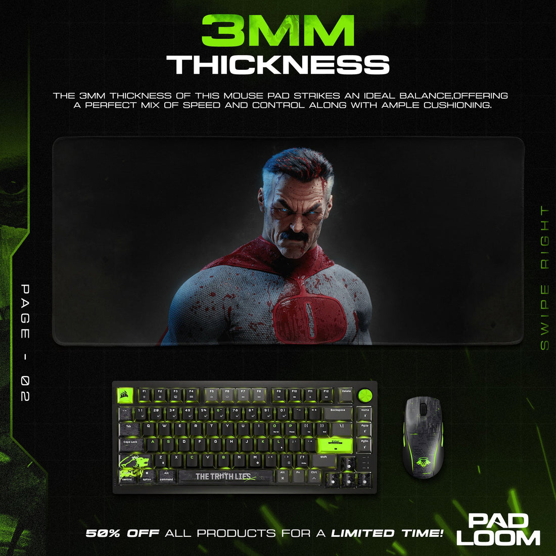
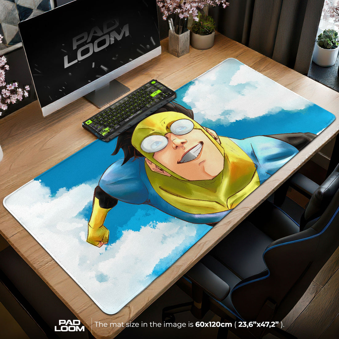
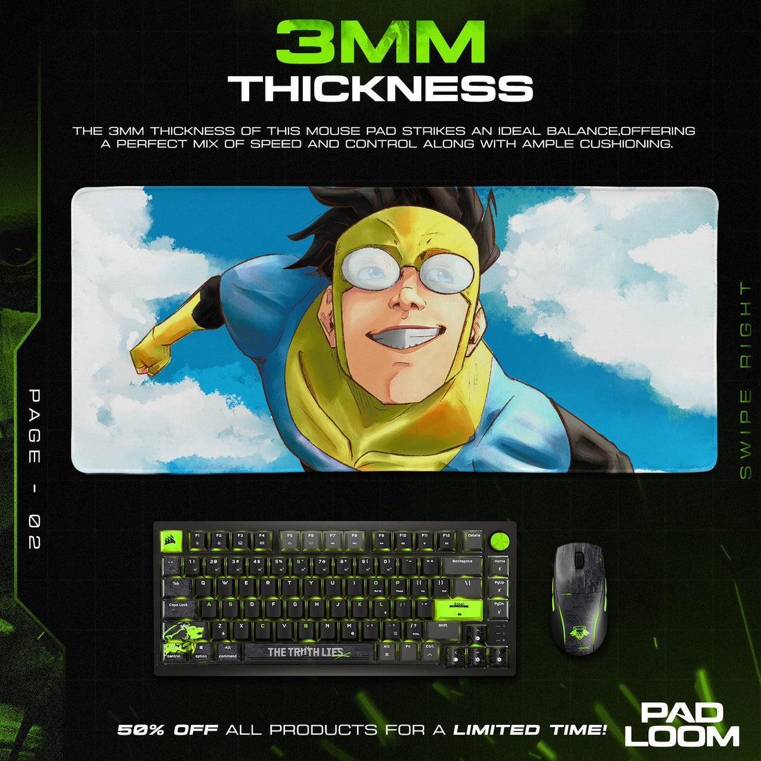
The artistic DNA of Invincible Mouse Pads draws from both comic book tradition and modern animation innovation, featuring bold line work that emphasizes motion and impact while maintaining the clean readability essential for functional desk surfaces. Mark Grayson's transformation from awkward teenager to battle-hardened warrior plays out across designs that might show him hovering confidently above Chicago's skyline or locked in desperate combat with Viltrumite invaders, his costume progressively more torn and bloodied as fights escalate beyond anything traditional superhero media dares depict. The color palette shifts dramatically between designs – from the bright optimism of early episodes where blue skies frame heroic poses to the crimson-soaked battlefields where idealism dies alongside countless casualties. Omni-Man's presence looms large across many pieces, his mustached visage shifting from protective father to genocidal conqueror, creating designs that work as both celebration and warning about the nature of power.
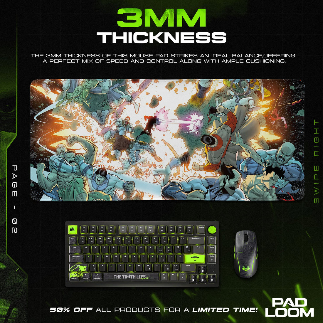
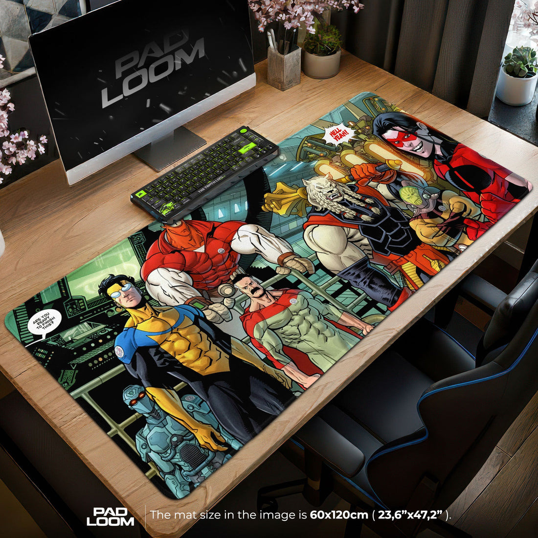
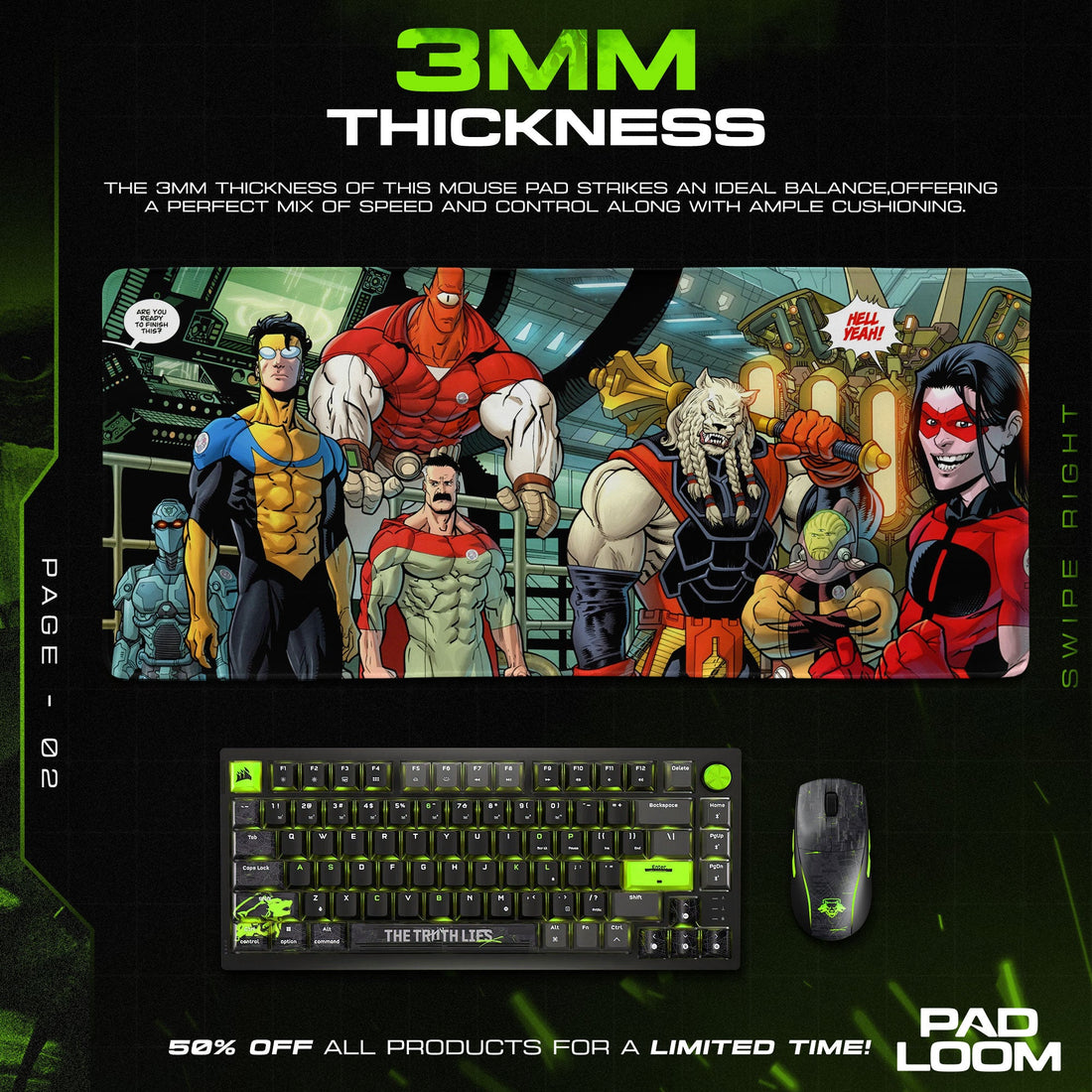
Within the expanding universe of movie and tv mouse pads, Invincible occupies a unique position as the series that proved animation could deliver mature superhero narratives without sacrificing visual dynamism or emotional depth. The imagery ranges from iconic comic book covers recreated with perfect fidelity – issue #1's simple shot of Mark floating above suburbia, unaware of the horrors ahead – to original compositions that blend multiple timeline elements, showing the hero's evolution through overlapping imagery. Atom Eve's matter-manipulation powers create particularly striking visuals, with pink energy constructs forming geometric patterns that serve both aesthetic and functional purposes on mouse pad surfaces. Robot's gleaming armor reflects different eras of his character development, from mysterious hero to morally ambiguous leader, while Battle Beast's primitive fury contrasts against high-tech backgrounds in designs that celebrate the series' genre-blending approach. These varied visual styles ensure that whether you prefer minimalist designs featuring just the iconic "I" logo or complex battle scenes with dozens of characters, there's a perfect match for your workspace aesthetic.
The visceral nature of Invincible's action sequences presents unique challenges for Mouse Pads designs, as the series' signature ultraviolence must be suggested rather than explicitly displayed for workplace-appropriate accessories. Artists achieve this through creative composition choices – showing the wind-up to Omni-Man's devastating punch rather than the impact, depicting energy blasts mid-flight rather than their gruesome destinations, or focusing on determined facial expressions rather than the carnage below. The printing process must capture subtle details that fans recognize as precursors to infamous scenes – the train in the distance before the infamous massacre, Omni-Man's hand on Mark's shoulder before revelations shatter their relationship, or the Guardians of the Globe assembled for what viewers know is their final meeting. These anticipatory moments create dramatic tension even in static images, transforming a simple large desk pad into a narrative checkpoint that reminds users how quickly situations can escalate from calm to catastrophic.
Collectors particularly value designs that reference specific moments that defined the series' reputation for subverting superhero tropes with brutal honesty. The subway scene's aftermath rendered in abstract crimson patterns, the Flaxan invasion showing time dilation effects through overlapping imagery, or Cecil Stedman's scarred face emerging from shadows while maintaining government composure. These scenes resonate because they represent moments when Invincible distinguished itself from other superhero properties by refusing to reset to status quo, instead building consequences upon consequences until characters barely resemble their optimistic origins. The technical requirements for reproducing these complex emotional moments demand printing precision that maintains color separation even in the darkest scenes, ensuring that whether depicting the depths of space or underground government facilities, visual clarity supports rather than obscures storytelling.
The philosophical weight of Invincible Mouse Pads extends beyond simple fandom into examinations of power, responsibility, and the cost of maintaining principles in impossible situations. Fans often choose designs based on which character's journey resonates with their own struggles – Mark's attempts to balance normal life with extraordinary responsibilities speak to anyone juggling multiple roles, while Debbie Grayson's strength in facing betrayal and rebuilding resonates with those who've survived relationship trauma. The Viltrumite Empire's social Darwinist philosophy attracts those grappling with competitive professional environments where only the strongest survive, though displaying such imagery might serve as critique rather than endorsement. These character alignments transform workspace accessories into philosophical statements about how we navigate moral complexity when simple answers prove inadequate.
The evolution of animation techniques visible across different season designs showcases the medium's growing sophistication in handling mature content. Season one designs often feature cleaner, more traditional superhero poses that bely the violence to come, while season two imagery embraces darker compositions with multiple light sources creating dramatic shadows that fragment characters into light and dark aspects. The technical challenge of reproducing animated movement on static surfaces leads to creative solutions like motion lines that suggest super-speed without blur, or multiple ghosted images showing fight choreography progression. Some designs incorporate comic book panel layouts that compress entire fight sequences into single compositions, allowing viewers to read action flow while maintaining mouse pad functionality.
Custom Mouse Pads featuring Invincible elements allow fans to create personalized combinations that reflect their specific relationship with the series, perhaps incorporating favorite quotes like "That's the neat part – you don't" overlaid on relevant imagery or combining multiple characters in dream team configurations never seen in canon. The precision required for these personalized desk mat creations ensures that whether someone wants their office reimagined as the Guardian of the Globe headquarters or their pet drawn in Invincible costume style, the final product maintains the quality that honors the source material's artistic standards. The logistics of distributing these items across U.S. territories requires careful handling to preserve the vibrancy of designs featuring subtle color gradients essential to the animation style, ensuring that Allen the Alien's purple skin maintains its otherworldly quality rather than appearing merely bruised.
The workspace psychology of displaying Invincible Mouse Pads reflects different professional philosophies about confronting harsh realities versus maintaining optimistic facades. Legal professionals might appreciate Cecil's morally gray decision-making as reflection of real-world compromise, while healthcare workers connect with the series' unflinching portrayal of physical trauma and recovery. Educators find value in Mark's journey from naive idealism to informed determination, using his evolution as metaphor for student growth through difficult lessons. Creative professionals gravitate toward the series' willingness to deconstruct genre conventions, finding inspiration for their own rule-breaking work. These thematic connections elevate desk accessories beyond mere decoration into daily reminders that growth often requires confronting uncomfortable truths.
The durability requirements for Invincible Mouse Pads reflect the series' own emphasis on consequences and lasting damage, as these products must maintain their visual impact through extended use without the convenient reset buttons that other superhero properties employ. The materials must withstand constant friction without degrading fine details like the texture of Viltrumite uniforms, the transparency effects in Monster Girl's transformations, or the mechanical intricacy of Robot's various bodies. Special coatings protect against spills that might otherwise obscure the specific blue of Mark's costume or the pink energy signatures of Eve's powers, while reinforced edges prevent the fraying that could unravel carefully composed battle scenes. This practical resilience mirrors the series' themes about enduring through trauma rather than emerging unscathed.
The cultural impact of Invincible as breakthrough mature animation manifests through mouse pad designs that serve as conversation starters about medium prejudice and storytelling evolution. Displaying these designs signals appreciation for narratives that trust audiences with complexity, refusing to simplify moral questions or provide comfortable resolutions. The presence of Invincible imagery in professional spaces challenges assumptions about animation being inherently childish, similar to how the series itself forced reconsideration of what animated superhero content could achieve. These designs often spark discussions about favorite shocking moments, character development arcs, or speculation about future seasons, creating community connections among fans who appreciate storytelling that respects viewer intelligence.
The sensory memory triggered by Invincible Mouse Pads extends beyond visual recognition to emotional resonance with specific scenes' impact – the sick feeling when Omni-Man's true nature reveals itself, the triumph when Mark finally lands a meaningful blow against a superior opponent, or the dread when familiar situations signal incoming tragedy. These emotional anchors make using Invincible-themed workspace accessories surprisingly engaging, as routine tasks overlay with memories of narrative tension and release. The quality of color reproduction must perfectly capture the specific shade of red that signals serious injury versus comic book effect, the exact yellow that distinguishes Mark's costume from other heroes, and the alien purples and greens that separate earthbound from cosmic threats.
